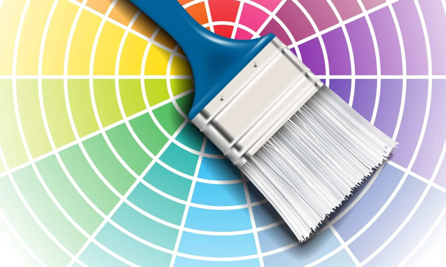
How do you make your designs POP? Want to wow your boss/teacher in your next presentation? Sure, templates exist in PowerPoint, but why not add a little zest to your slides by adding a bit of eye candy?
Without a doubt, adding a color theme to your digital creations increases its appeal. However, you will quickly notice that some colors simply do not mesh well with others. There is already an established method to color harmony, called the Color Wheel.
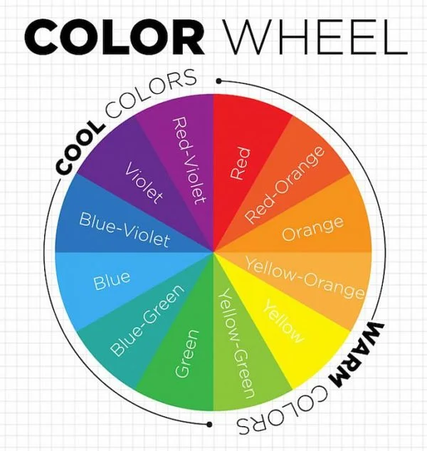
Types of Color Harmony:
- Complementary – Colors that are opposite each other on the wheel
- Analogous – Colors that are next to each other on the color wheel
- Monochromatic – Same color but of different shades
Using the Color Wheel is simple – pick a color, and depending on your choice of color harmony, pick the opposite or adjacent color. Now go and make your designs shine!